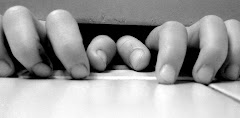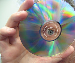

So which one is better? Top or bottom?
Inside: Photos of eyeballs, bees, eyeballs, blue hands, and eyeballs. Also inside: Thoughts I want you to read and to live by and, when especially inspired, to set to opera. Also inside: my fight against vegetable tyranny. Just a little something I do so you don’t have to. You're welcome. Come on in and get your jibber jabber on!


.jpg)


10 comments:
Top one. Definitely.
Top. Any other answer would be wrong.
I agree completely, the top is definitely better.
The top one has amazing movement to it. It just sweeps your eye right through it like you're on a roller coaster. Love ly!
However, the second one has a really nice optical illusion element to it. While looking at the top of it, the dark triangle seems to be something solid. However, as your eye follows it to its base, you realize of course that it's not; it's just darker space created by the light around it. You follow it back up, down. Soon you're feeling sleepy, very sleepy.
I agree. Top.
Top. The bottom is too discernible. I know that hurts; don't cry.
Top. (I thought I had posted such several days ago, but apparently not).
I can see why everyone likes the top, but I think I like the bottom one better. It looks like an alley way with cool reflections.
Jake L---
Thanks, guy. Here's what I think. The top one is definitely nicer because it's smoother and has dark shading. But the bottom one is more technically perfect as a composition.
Jake, do you understand that?
Okay, let's see if you understand this instead. Here's a joke.
"One muffin says to the other muffing, "Man, it's sure hot in here, don't you think?" And the other muffin said, "AHHH!! Talking muffin!!!"
Pretty good, eh?
Mr. Bailey, I do get your joke, but here's a better one.
Where do actors like to camp?
The Hollywoods!
Post a Comment